Analytics and Data Visualisation

    Contact

Understanding data

According to Forbes, between 2016 and 2018, 90% of the data of the world was created! The value of that data to someone is incredible, so remember that when you use your 'free' service from a social media company.

Data analysis and visualisation is an area that excites me. Taking meaningless data, organising it to create meaning, and to provide 'insights' can be really eye opening.

What are 'insights'?

Data is the raw numbers that are captured, information is what you notice about that data e.g. out of 100 bananas 10 are bruised, an insight is gained by analysing the data and information to understand why it's happened.

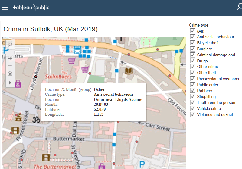
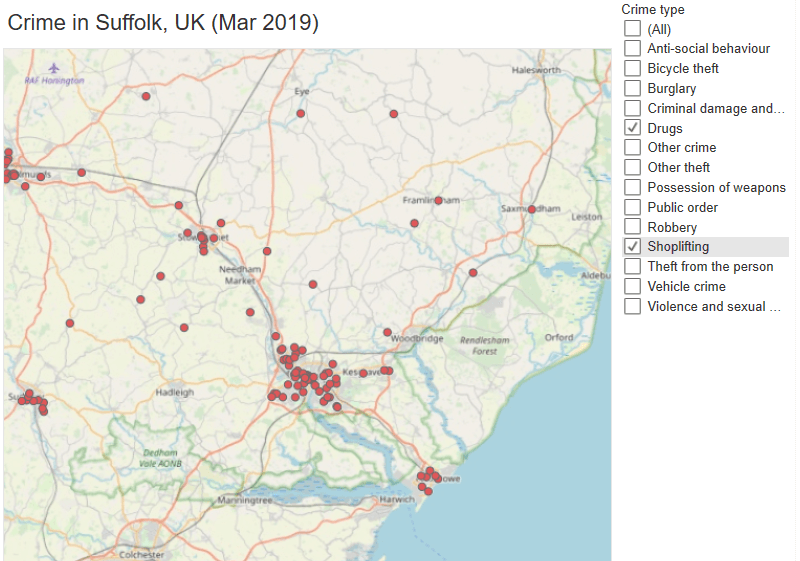
The image in this section shows where crime has occurred and although it is interesting to those who live in the area, the data could tell us a lot more. If this data is analysed to look at crimes over a period of time, in certain locations or some other factor, then we might get an 'insight'. This is why data is so exciting.

Data visualisation

Data visualisation is a term that describes any effort to understand the significance of data by placing it in a visual context. Doing this allows patterns and trends that might go undetected in text-based data to be exposed and recognised easier.

Zoomed in Tableau crime map of Ipswich Town centre in March 2019
Street level crime in Ipswich, UK (Mar 2019)
See it in Tableau Public Server

Visualisation of crime in Ipswich, UK (March 2019)

Data visualisation is very powerful and even in this basic example which just plots where a crime was committed, so much more can be gleaned than from just looking at a list of text. You can interact with this 'viz' by selecting/deselecting thet type of crime, and zooming in or out to see crime over the region.

You can also view this on Tableau Public Server where additional 'vizzes' will be added.

Tip: Use shift and mouse left click to scroll around the map.

Tableau visualisation of crime locations in Ipswich, UK (Mar 2019)

Crime in Suffolk, UK

I've put together an example using UK Home Office data for crime in Suffolk, UK in March 2019. This is a huge data source hence why I've just taken a small subset of the data.

By seeing the 'viz' on Tableau Public Server, you will be able to view crime from high level regional crime data right down to street level. This data can be further refined by selecting only certain crimes, in this case it's drugs and shoplifting offences.

In this example, it's no surprise that the major population densities have clusters of crime. The exciting part is taking this data, expanding the data points, and drilling down to uncover something new.

As you can see, with the right tools and an inquisitive mind, data is a high value resource.

Tableau crime map of Suffolk for March 2019
Drugs and shoplifting offences, Suffolk, UK (Mar 2019)
See it in Tableau Public Server

Shall we talk?

Lets have a conversation

If you would like to know more about how I've helped to transform some the world's biggest and well known businesses, across diverse industries in the United Kingdom, Singapore, and Hong Kong, then please drop me a line. Let's have a chat and I'll buy the coffee!

Multiple screens showing responsive web developement next to a hot drink for a meeting

Turn your idea into digital reality

Many of my clients requiring web design have been small or start up businesses and need a lot of guidance. I love these kind of projects as I feel I can be a part of a new and exciting business from the very beginning!

What can I call you?
Enter your email address
It would be nice to tell us why you are contacting us!
To prevent spam mail, enter the sum of the spam captcha